A System for Every Screen

Design System for an Airline — COPA Airlines
Challenge
Business Problem: COPA Airlines lacked a unified design language across its digital products, resulting in inconsistent user experiences, duplicated design work, and development inefficiencies. Each team was creating similar components from scratch, leading to brand inconsistency and slower product delivery.

User Problem: Customers experienced fragmented interfaces across booking flows, check-in processes, and account management—undermining trust and creating friction in their travel journey. The lack of visual cohesion made the digital experience feel disjointed and unprofessional.
My Contributions
As Senior Experience Designer overseeing the design system, I was responsible for:
  • Conducting comprehensive component audits across all COPA Airlines digital products
  • Designing and maintaining a scalable library of reusable UI components
  • Establishing documentation standards that bridged design and development workflows
  • Facilitating cross-functional collaboration between design, engineering, and product teams
  • Defining governance processes for component updates and version control
  • Ensuring accessibility compliance and responsive behavior across all components
Overview
Company: COPA Airlines (via EPAM)
Role: Senior Experience Designer — Design Systems
Platform: Web & Mobile (Responsive)
Nov 2022 - Nov 2023
Design Process
1. Foundation & Taxonomy
Established design tokens (colors, typography, spacing, elevation) and created a clear component categorization system: Foundations → Atoms → Molecules → Organisms.
2. Component Design & Iteration
  • Created low-fidelity wireframes for 50+ core components
  • Built interactive prototypes in Figma with all variants and states
  • Conducted weekly design critiques with the team
  • Tested responsive behavior across 8 device breakpoints
3. Developer Handoff & Collaboration
  • Implemented bi-weekly sync meetings between design and engineering
  • Established a feedback loop for implementation challenges
4. Documentation & Rollout
  • Wrote comprehensive guidelines for each component
  • Created onboarding materials for new team members
  • Launched internal workshops to drive adoption across 5 product teams
Key Features Designed
Component Library (80+ Components)
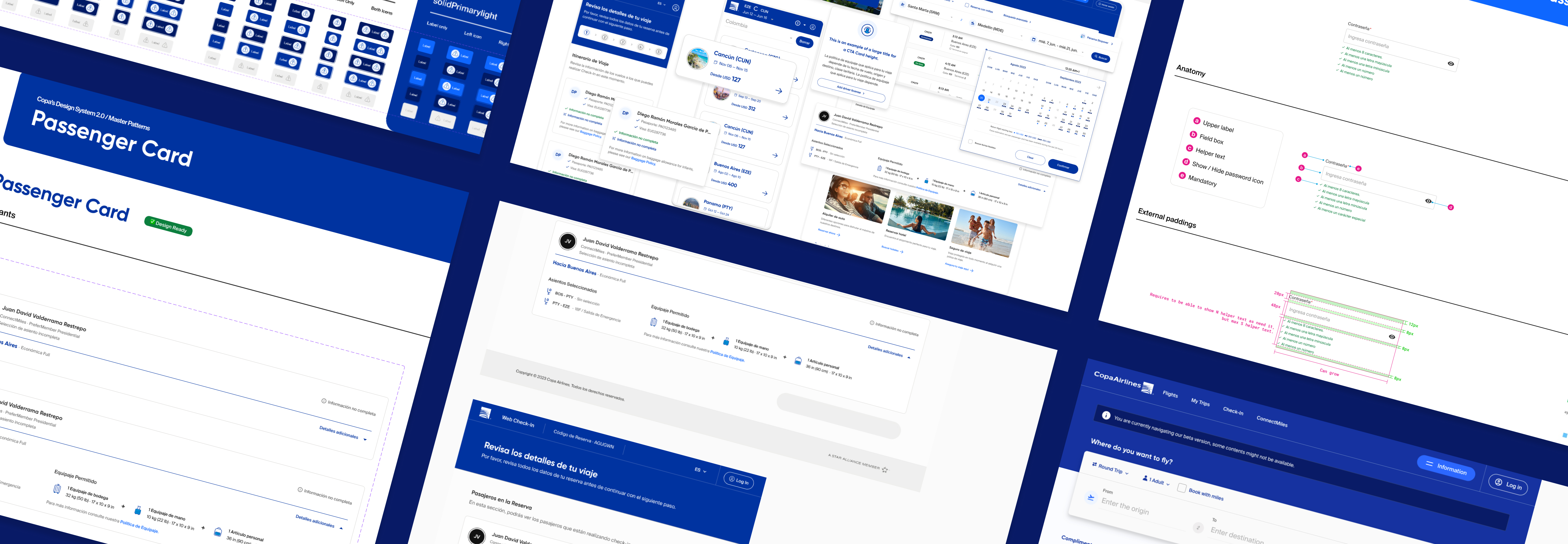
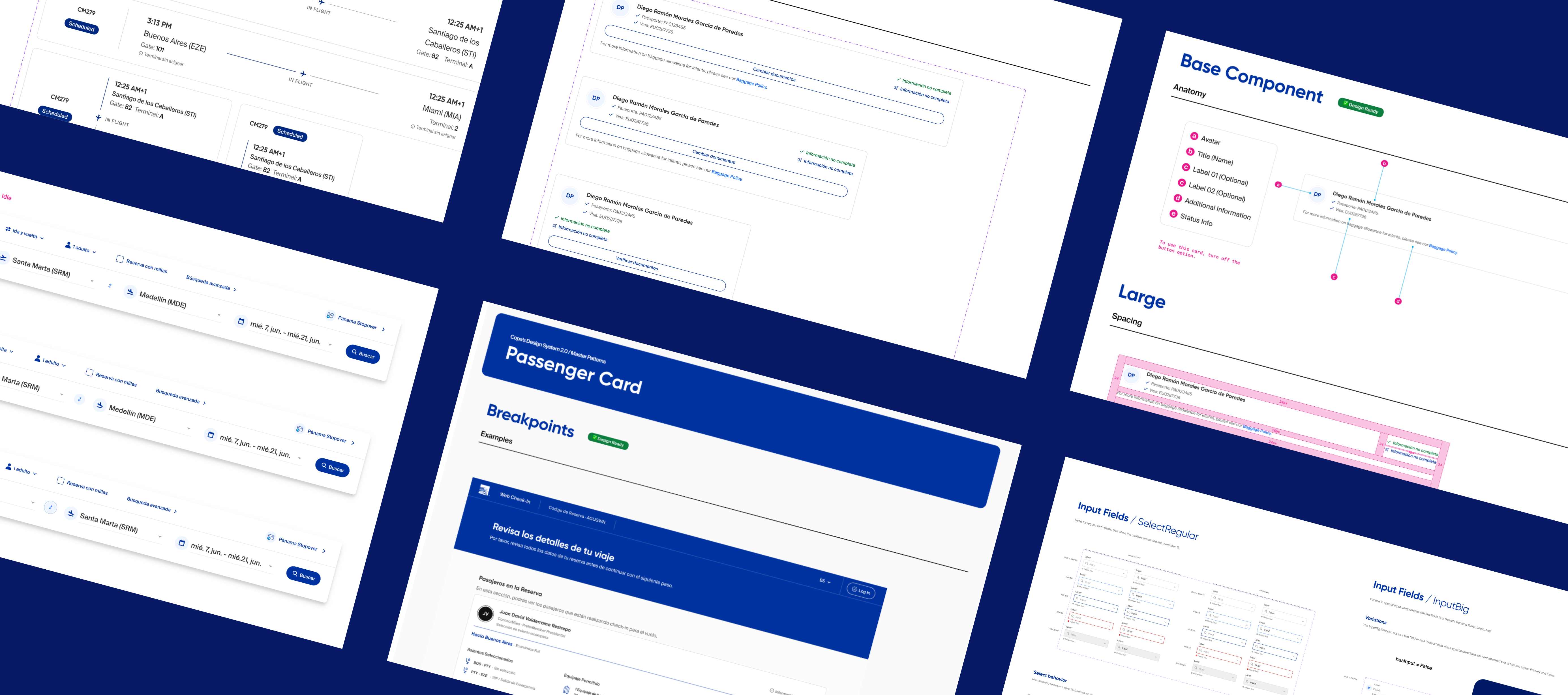
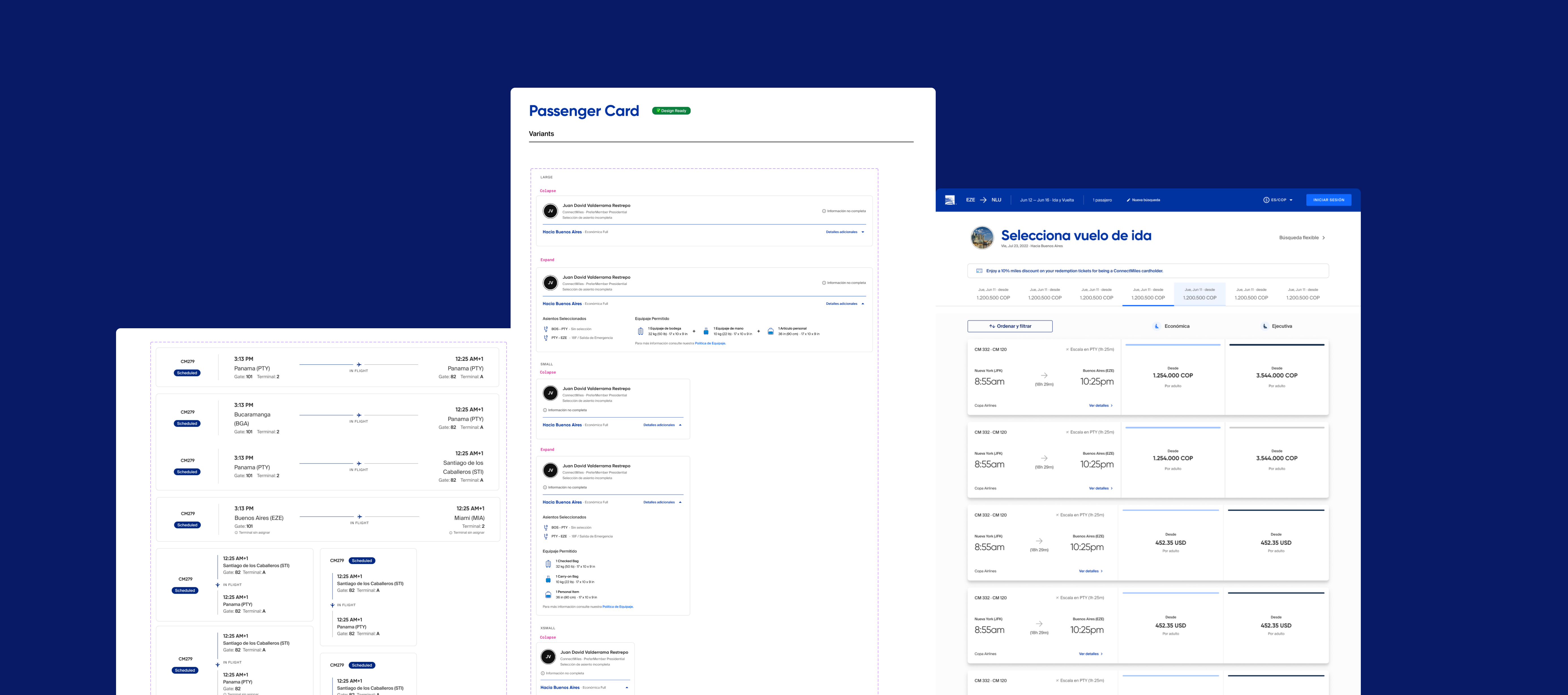
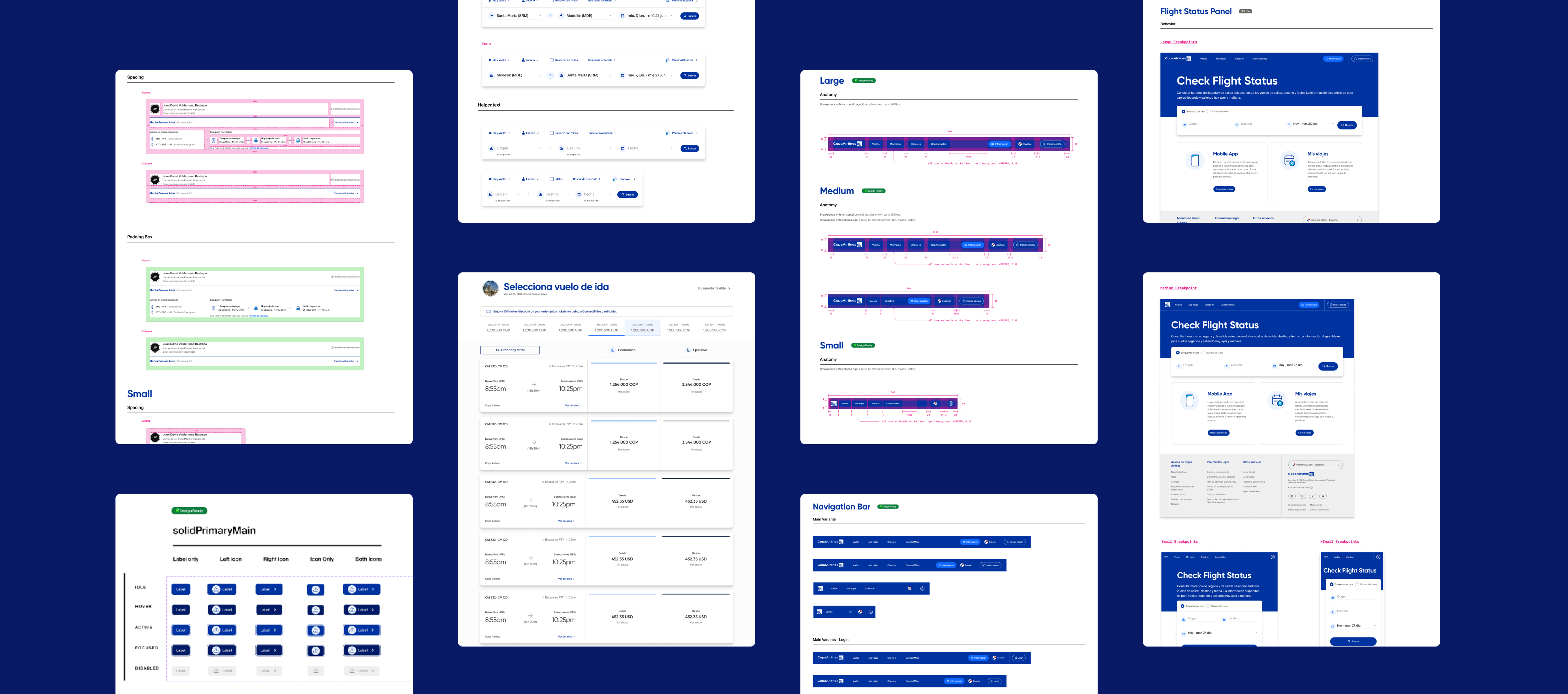
Built a comprehensive system covering buttons, form inputs, navigation patterns, cards, modals, alerts, data tables, and airline-specific components like flight status indicators and baggage trackers.
    Documentation Hub
    Created an accessible knowledge base with:
    • Component anatomy and variants
    • Usage guidelines and do's/don'ts
    • Implementation examples
    • Responsive behavior specifications
    • Accessibility annotations
    Design Tokens System
    Established a scalable token architecture enabling:
    • Consistent theming across platforms
    • Easy brand updates (changed primary blue across 200+ screens in 1 day)
    • Dark mode readiness for future implementation

    Impact
    Design Efficiency
    • The component library significantly reduced time spent designing common UI patterns — designers stopped rebuilding the same elements from scratch, and most new features were assembled primarily from system components.
    Development Speed
    • Engineering teams reported noticeably faster implementation times for new features, and UI-consistency bugs dropped as components became the single source of truth.
    Scalability in Practice
    • The token architecture proved its value early: brand-level updates that previously required screen-by-screen changes could be propagated across the entire product suite in a fraction of the time.
    Learnings
    1. Flexibility vs. Consistency is Solvable
      By designing components with thoughtful variant systems and clear customization boundaries, we achieved both brand uniformity and product-specific flexibility. The key was establishing "where to bend" vs. "where to hold firm."
    1. Documentation Drives Adoption
      The design system's success hinged not on component quality alone, but on making it effortless to use. Clear documentation, examples, and onboarding reduced the barrier to entry for skeptical team members.
    1. Governance Requires Ongoing Investment
      A design system is never "done." Establishing a clear contribution model and update cadence was critical to keeping the system relevant as product needs evolved.
    1. Cross-Functional Collaboration is Everything
      The strongest outcomes emerged when designers and developers co-created solutions. Regular sync meetings and shared ownership eliminated the traditional "throw it over the wall" handoff mentality.