From Code to Human UI

A UX Audit of a Financial Deal-Creation Wizard
Challenge
Business Problem: An internal deal-creation tool was being migrated from a technical, config-file-based setup to a guided interface for business users. The goal was to turn a developer-oriented process into a human-friendly UI — but that transformation was only half-complete. Technical complexity remained exposed in a workflow where mistakes carry financial consequences, undermining the very purpose of the redesign.

User Problem: Business users had to complete a 12-step wizard that surfaced raw code, validated only whether fields were filled (not whether the values were correct or coherent), and offered inconsistent guidance across steps. In a money-critical context, these gaps created real risk of costly errors — from misdirected funds to misconfigured financial terms — with limited ability to catch or correct them before submission.
My Contributions
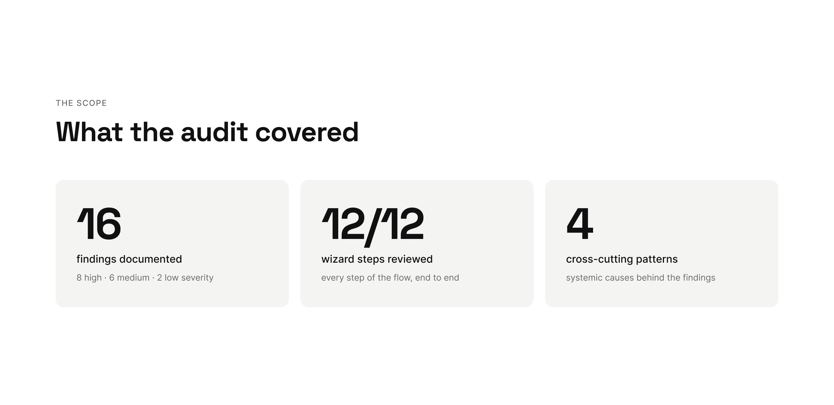
  • Conducting a screen-by-screen UX audit of a 12-step deal-creation flow, from setup through final review and submission.
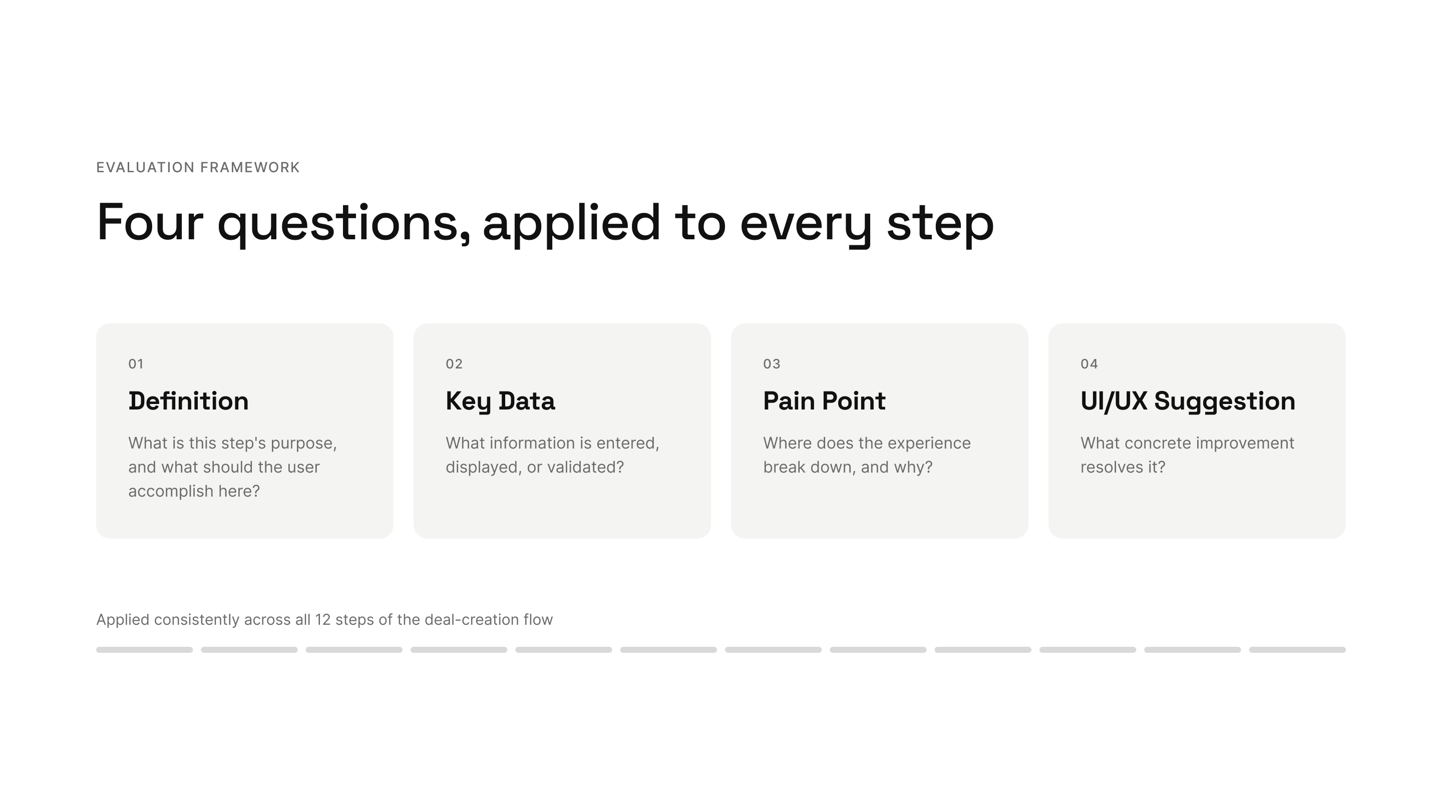
  • Developing a 4-pillar evaluation framework (Definition · Key Data · Pain Point · UI/UX Suggestion) applied consistently to every step.
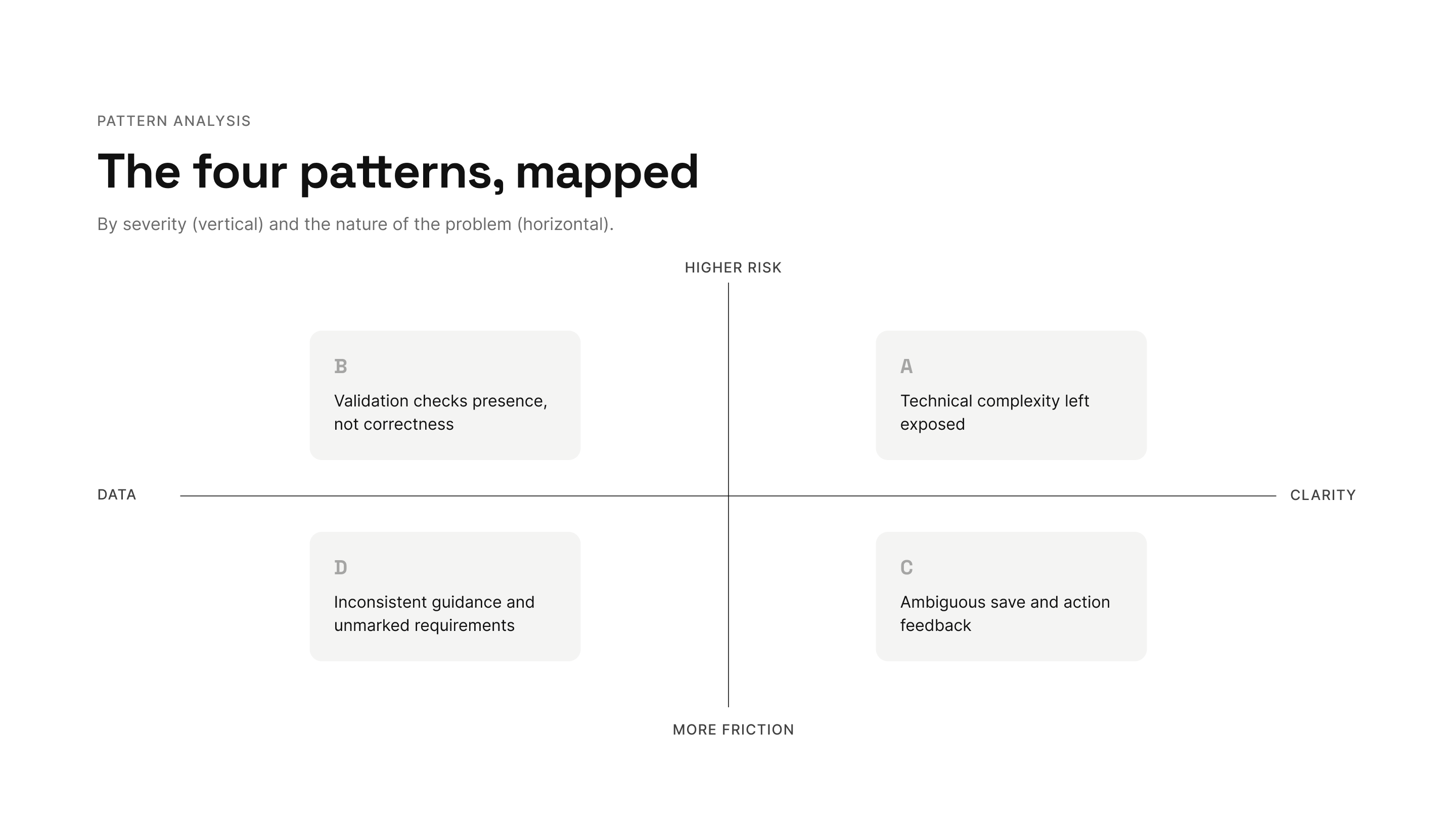
  • Identifying four cross-cutting patterns that explained the individual issues as symptoms of deeper, systemic problems.
  • Prioritizing findings by severity and business risk, separating money/data/rework risks from friction and clarity issues.
  • Defining acceptance criteria and QA next steps, mapping where testing effort should concentrate.
  • Delivering a signed-off single-source-of-truth document aligned with product and engineering stakeholders.
A framework-driven audit
Rather than reviewing screens ad hoc, I applied a consistent 4-pillar framework to each of the wizard's 12 steps. This turned a subjective "what feels off" review into a structured, repeatable evaluation that product and engineering could act on.
The 4 pillars, applied to every step:
  • Definition — What is this step's purpose, and what should the user accomplish here?
  • Key Data — What information is entered, displayed, or validated?
  • Pain Point — Where does the experience break down, and why?
  • UI/UX Suggestion — What concrete improvement resolves it?
Process:
  • Walked through the entire flow step by step, in the test environment, focusing on the real production experience.
  • Documented each step in its own record, with supporting notes and micro-tests (entering invalid or boundary values to see how the system responded).
  • Flagged issues collaboratively on a shared board, tagged by severity.
  • Consolidated everything into a single source-of-truth document, signed off with product and engineering.
Four cross-cutting patterns
The individual issues weren't isolated bugs — they clustered into four systemic patterns. Naming the patterns (rather than just listing symptoms) made the findings far more actionable.
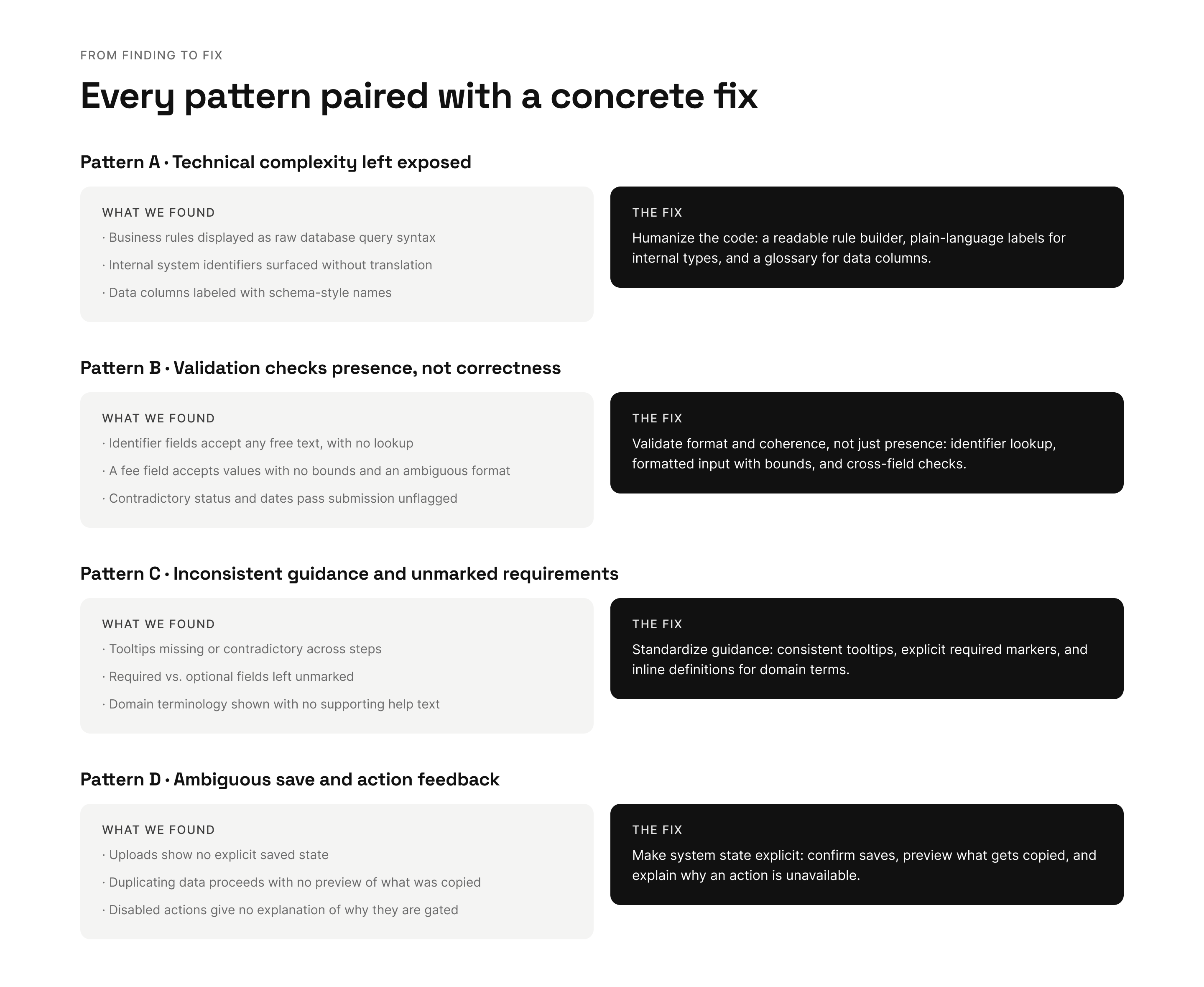
    1. Technical complexity left exposed
    The interface surfaced developer-oriented content — raw code, technical identifiers, and database-style logic — directly to business users, instead of translating it into plain language. This directly contradicted the redesign's core goal of turning a technical process into a human-friendly one.
    2. Validation checked presence, not correctness
    The system confirmed that fields were filled, but not that their values were valid or coherent. Identifier fields accepted free text, a fee field accepted ambiguous input with no bounds (where a misread value could cause a 100× error in charges), and a record could be submitted with logically contradictory dates. In a financial workflow, "filled in" is not the same as "correct."
    3. Inconsistent guidance and unmarked requirements
    Tooltips were missing or contradictory, required versus optional fields were unmarked, and financial terminology appeared with no supporting help text. Users were left guessing what was mandatory and what each field expected — contradicting the product's own stated requirements.
    4. Ambiguous save and action feedback
    Key actions gave no clear confirmation of what had happened. Uploads showed no explicit save state, duplicated data proceeded with no preview of what was copied, and disabled buttons offered no explanation of why they were gated — leaving users unsure whether their work was saved or their action had succeeded.
    A highlighted example — the reassurance/lock mismatch:
    Early in the flow, copy reassured users that "changes can be made at any time before submitting for review." In reality, the foundational details (deal type, names, country, currency) locked permanently after the first step. If an error surfaced at the final review, there was no way to fix it — the only path was to recreate the entire deal from scratch. A reassuring message placed at an irreversible moment is worse than no message at all.

    Design Efficiency
    The 4-pillar framework turned a subjective review into a structured, repeatable method — giving product and engineering a clear, prioritized map of what to fix and why, rather than a scattered list of complaints.
    Shared Alignment
    The audit was consolidated into a single source-of-truth document, reviewed and signed off with product and engineering. It moved the conversation from "these things feel wrong" to "these are the patterns, ranked by risk, with proposed fixes."
    Testing Focus
    The findings directly shaped QA scope — identifying the specific steps and validation gaps where regression and exploratory testing should concentrate, so limited testing effort targeted the highest-risk areas first.
    Patterns matter more than symptoms
    The real value wasn't in listing individual issues — it was in recognizing the four patterns underneath them. A stakeholder can dismiss ten separate bugs; they can't dismiss a systemic pattern that explains all ten. Framing findings this way made them impossible to ignore and far easier to prioritize.
    1. In fintech, a UX gap is a financial risk
      An unvalidated field or an ambiguous fee input isn't a cosmetic problem — it can mean misdirected money or a mistaken financial term. Tying each UX issue to its concrete business consequence made the case for fixing it self-evident.
    1. Reassurance at the wrong moment erodes trust
      Copy that reassures users right before an irreversible action creates a false mental model and sets them up to fail. Guidance has to match what the system actually does, especially at points of no return.
    1. A framework makes a review defensible
      Applying the same four questions to every step removed subjectivity and made the audit something the team could trust, act on, and reuse — not one designer's opinion, but a method.
    Overview
    Company: Affirm (via BlueCloud)
    Role: Product Designer
    Platform: Internal web tooling
    2026

    A note on confidentiality

    This case study presents an anonymized view of the work. The full audit documentation, annotated step-by-step walkthroughs, and the original design files remain confidential to the client. All visuals here are illustrative recreations built specifically for this portfolio — no real interfaces, data, or business logic are shown. I'm happy to walk through the process and methodology in more detail during an interview.