Designing at Brand Scale

Contributing to a Global E-Commerce Redesign — lululemon
Challenge
Business Problem: A global athletic apparel brand was redesigning its e-commerce experience for a new collection launch. The challenge was maintaining a consistent visual identity while the site expanded across multiple regions and languages — and balancing editorial brand storytelling with conversion-focused commerce.

User Problem: Shoppers moved between two different modes: browsing for inspiration (community, events, wellbeing content) and shopping with intent (finding a product, checking fit, checking out). The experience needed to let them flow between the two without friction, on desktop and mobile alike.
My Contributions
As Senior Visual Designer at Publicis Sapient, working with the lululemon design team, I contributed to:
  • Interactive prototypes for desktop and mobile, used to validate flows, transitions, and key interactions before handoff.
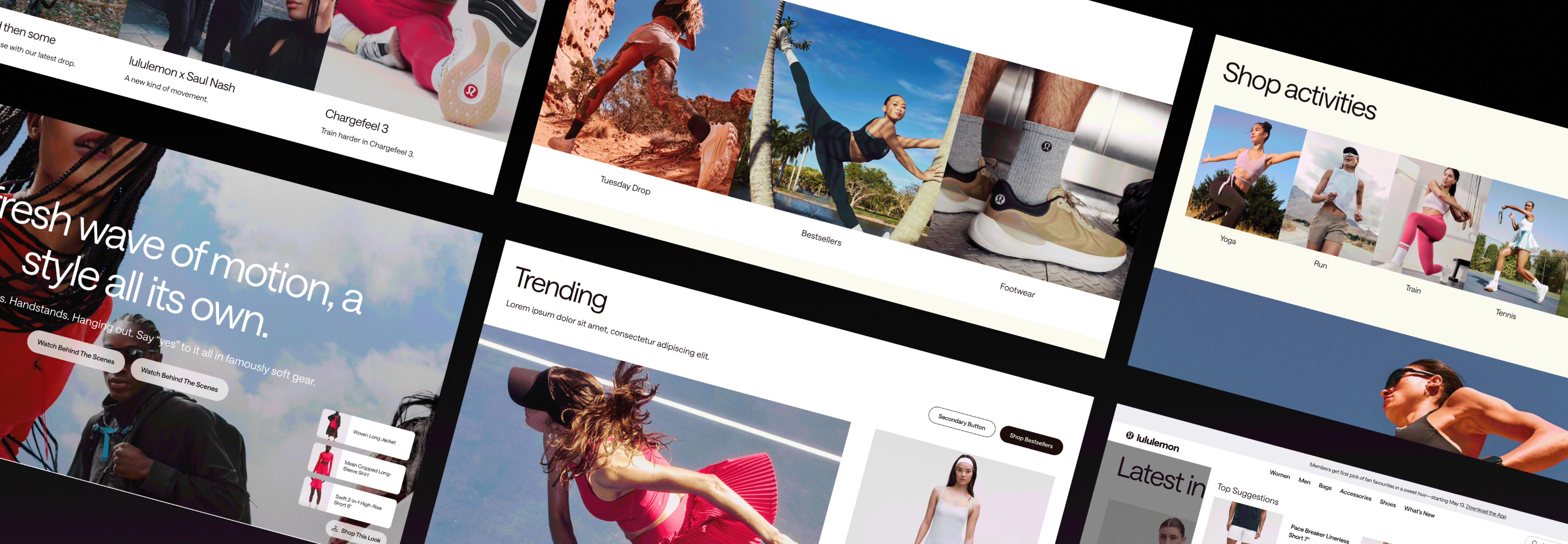
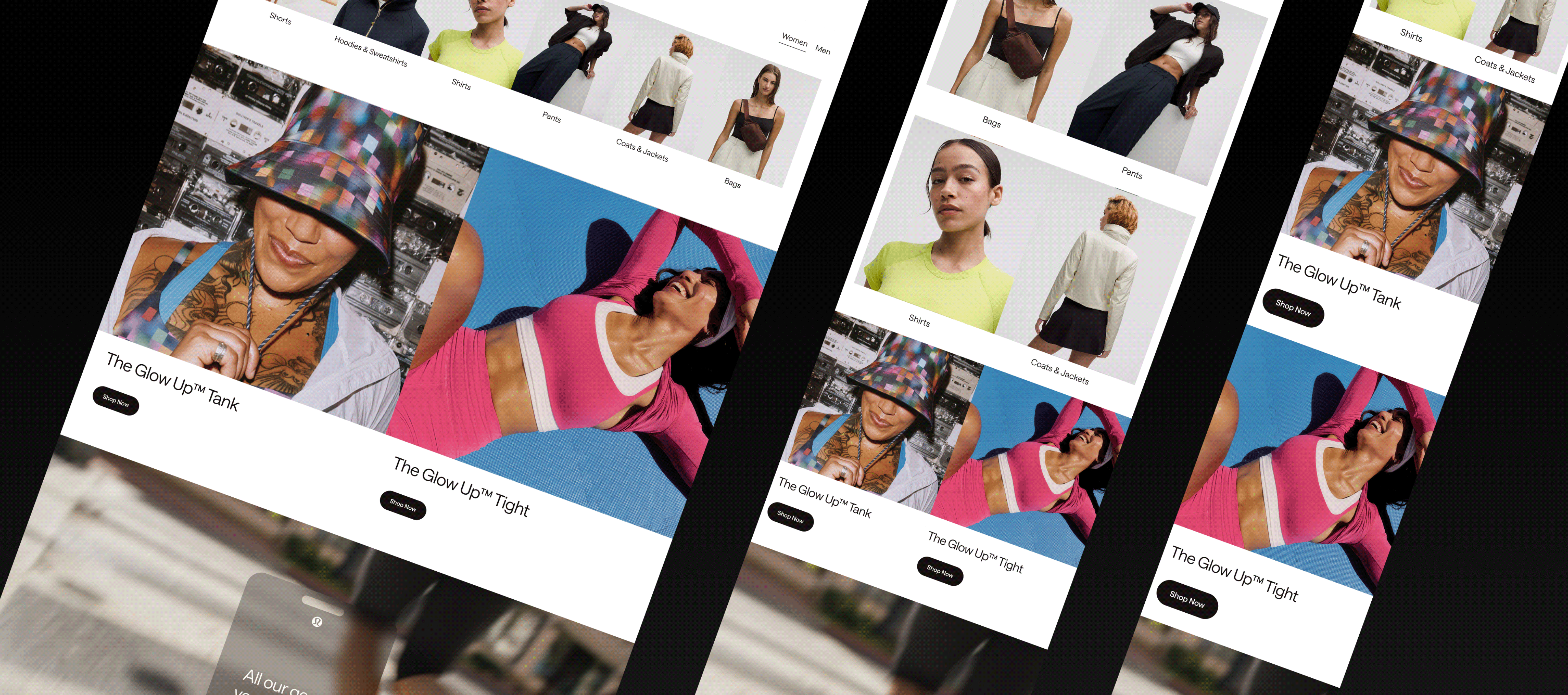
  • Component creation — product cards, fit selectors, checkout forms, and editorial modules — built to be reusable across pages and consistent with the refreshed brand system.
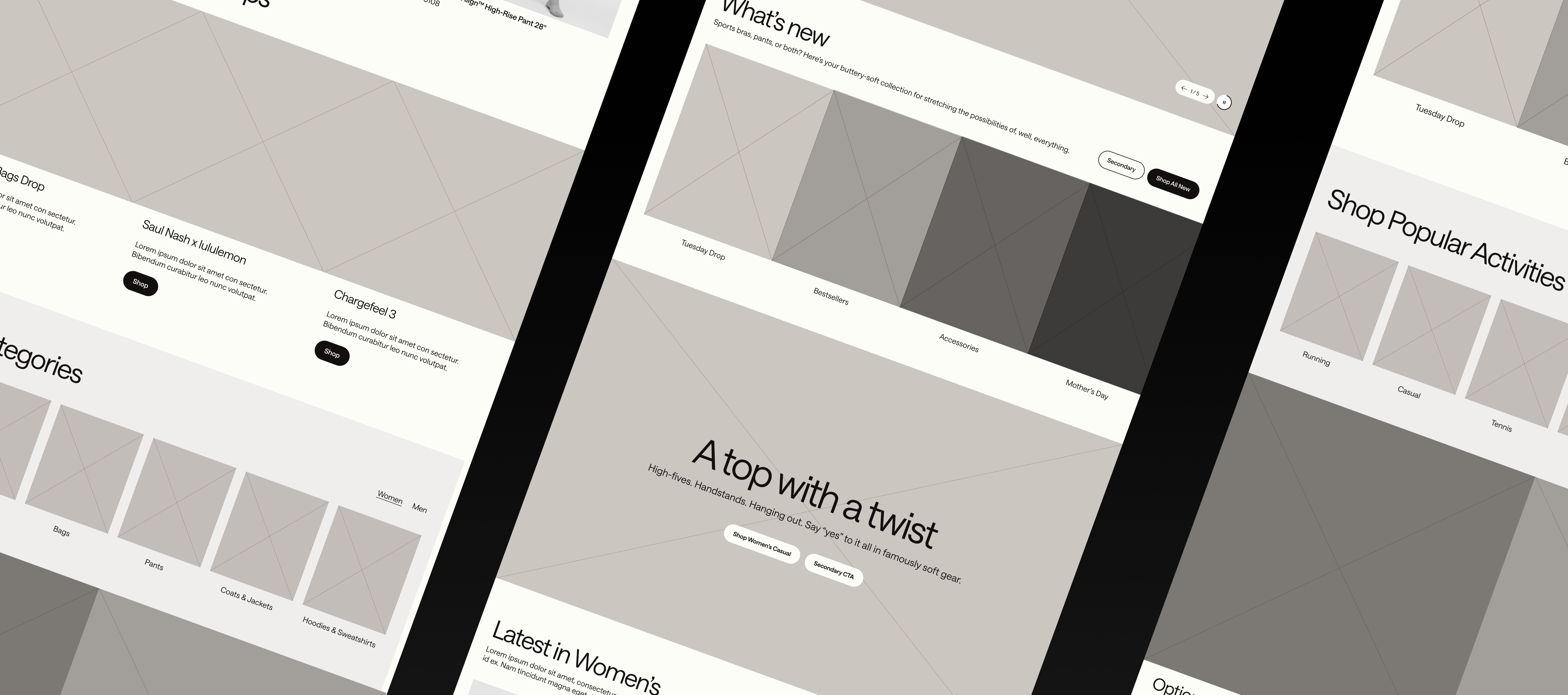
  • Design proposals and visual exploration, iterating on layout, typography, and hierarchy in line with the evolving brand direction.
  • Cross-functional collaboration with product, engineering, and the client's brand team to keep visual precision and technical feasibility aligned.
Designing within an established brand
Unlike a greenfield redesign, this work happened inside a mature brand system with strong existing equity. The craft was in extending it — finding room for new patterns without breaking the visual language shoppers already recognize.
  • Worked from the brand's evolving direction rather than defining it, translating it into concrete screen decisions.
  • Prototyped interactions early so flow and transitions could be evaluated before visual polish.
  • Built components with reuse in mind — every module had to survive translation into other languages and regions.
  • Iterated through review cycles with both agency and client-side stakeholders.
Balancing storytelling and commerce
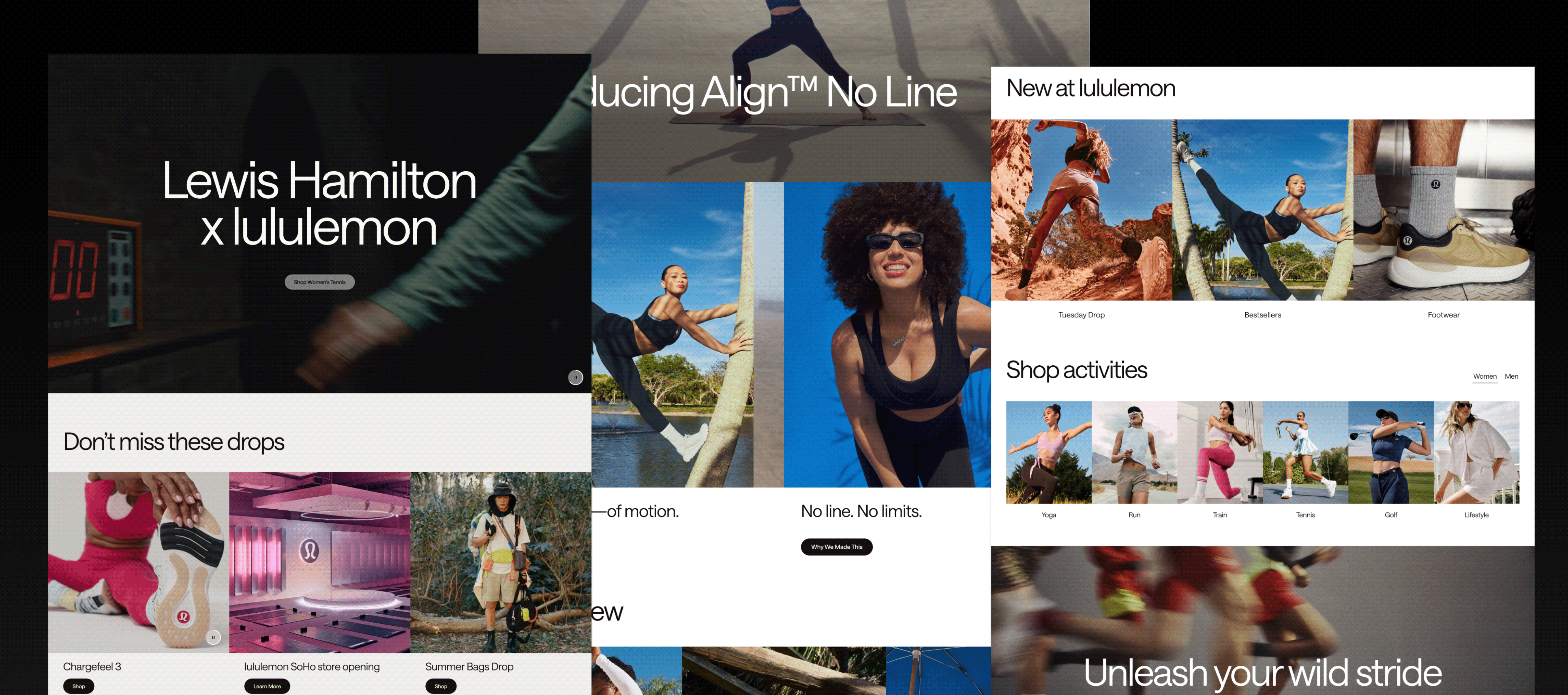
Editorial content and product pages pull in opposite directions: one invites you to linger, the other to act. Hierarchy and spacing did the work of letting both coexist without either feeling subordinate.
Components built for scale
A product card designed for one market has to hold up in another with longer text, different currency formats, and different imagery. Designing for that constraint from the start avoided rework later.
Prototypes over static comps
Interactions were validated in prototype form so stakeholders could experience transitions and flow, rather than inferring them from static screens.

Shipped
The redesigned site launched in 2025, showcasing the new collection.
Handoff-ready components
The work was delivered as an interactive Figma system with responsive breakpoints and handoff specs, so engineering could implement without ambiguity.
Contributing well is its own skill
On a large team inside an established brand, the value isn't in imposing a vision — it's in delivering precise, consistent work that fits the system and holds up under scrutiny from many stakeholders.
  1. Constraints sharpen components
    Designing for multiple regions and languages forced better component decisions than a single-market brief would have. The constraint improved the output.
  1. Brand systems are a language, not a rulebook
    Working inside a strong identity taught me to read intent behind guidelines rather than just follow them literally — knowing where the system expects flexibility and where it doesn't.
    Overview
    Company: lululemon (via Publicis Sapient)
    Role: Senior Visual Designer
    Platform: Web (responsive, multi-region)
    2025
    Prototype HomeInternal Story Page