Clarity of balance and actions
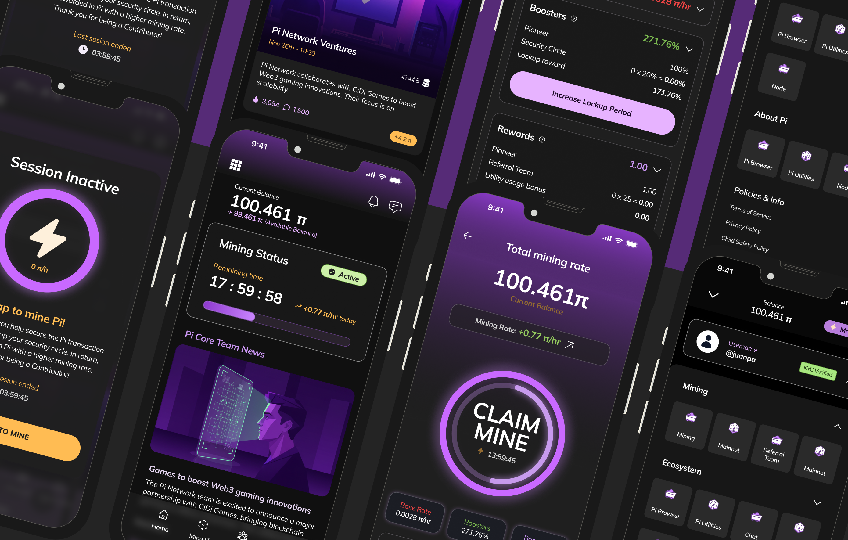
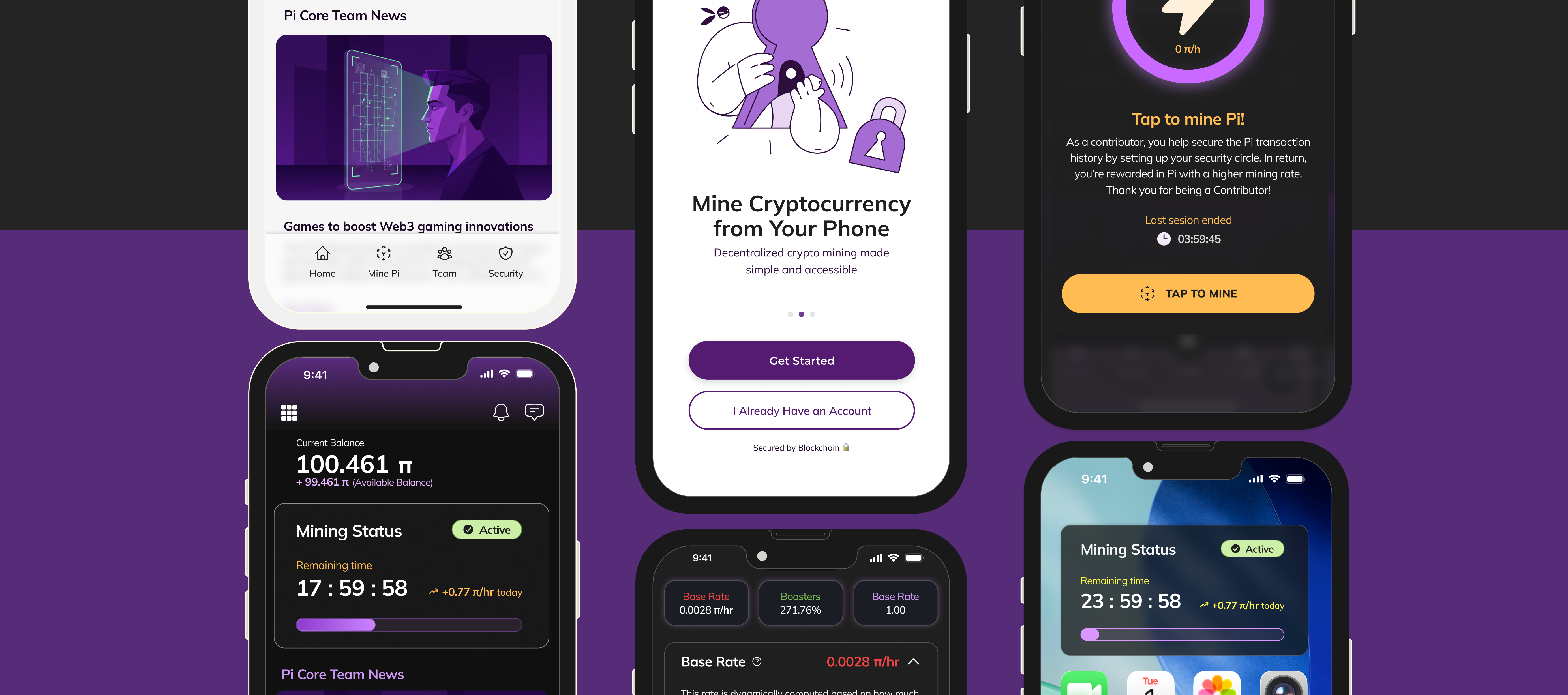
The previous home screen forced users to parse dense text and small controls to understand their position. The redesign groups total balance, available balance, and primary actions (send, receive, add) into a single hero region with strong hierarchy and generous spacing — so "how much I have" and "what I can do next" are answered instantly.
A mining flow that explains itself
Mining is the app's core loop, but the old experience obscured rate, status, and time remaining. The redesign centers a single large control with a countdown and an explicit rate, then breaks the total rate into its components — base rate, boosters, rewards — each expandable with a plain-language explanation. The opaque number becomes something users can actually understand and act on.
Meeting category expectations
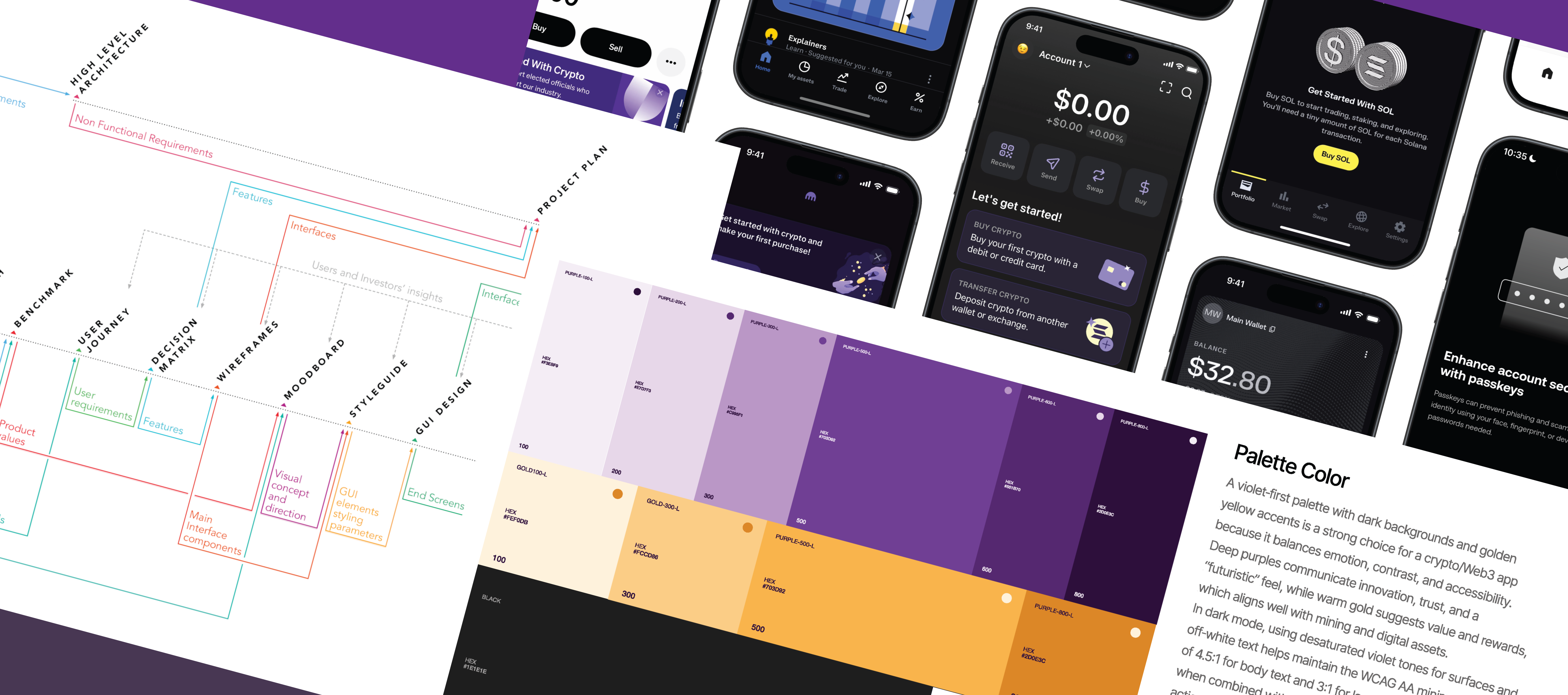
Navigation was consolidated into five primary tabs, with secondary functions moved to a separate menu — matching the mental model users bring from other wallets, and reducing the cost of learning the app.
Designing for two audiences at once
Every decision had to work for a first-time crypto user and an advanced one. The pattern that resolved this was progressive disclosure: simple by default, with depth available on demand.